White Rabbit
Crafted without compromise.
Client
White Rabbit
Gluten-free Italian food, from a dedicated bakery
Category
Supermarket challenger brand
Chilled and frozen free-from
What we did
Repositioning. Brand strategy. Brand identity. Tone of voice. Packaging design across the range. Digital.
The ambition
To become the UK's number one gluten-free pizza brand.
01The brief
The brand had
outgrown its
own packaging.
White Rabbit had come a long way: from two founders working out of an Oxford pub to a fast-rising supermarket challenger brand.
But the pack on shelf no longer reflected the business behind it. The positioning felt dated, and nothing on the box explained why this pizza cost more than the one next to it.
Free-from shoppers are used to paying more and expecting less.
That is the trap of the category: gluten-free is priced as a premium and experienced as a compromise. Break that link and the price stops being an apology.
So the job wasn't a repack. It was working out what White Rabbit should own, then building a brand world ready for its next chapter.
02Strategy
Two pillars,
both already true.
Italian provenance
Ingredients sourced directly from Italy, and a founder's own story to anchor it — co-founder Teo's Bergamo heritage. Not an Italian-sounding brand. An Italian one.
Gluten-free at the heart
Not a pizza brand with a free-from line, but a dedicated gluten-free bakery. Everything that comes out of it is made this way on purpose.
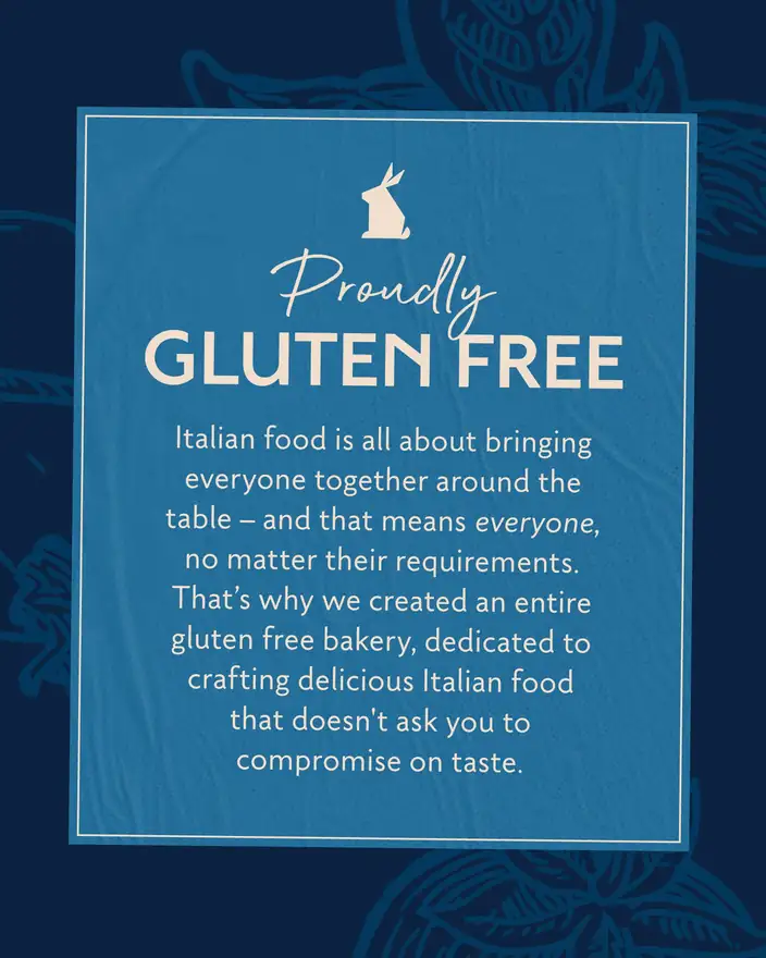
Genuinely delicious. Not “good for gluten-free.”
03The line
Crafted
without compromise.
The line does two jobs at once, which is why it earned the top of the pack.
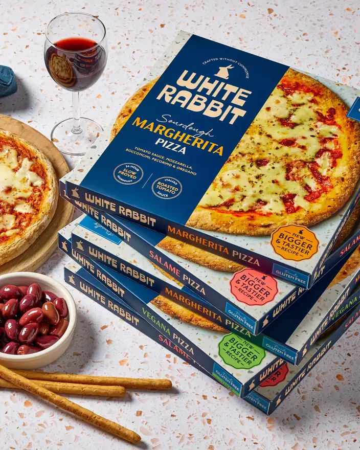
No compromise on craft. It gave us permission to put the making on the box — 24-hour slow-proved sourdough, Italian roasted tomato sauce — so the premium price is explained before anyone has to ask.
No compromise for anyone at the table. Italian food is about bringing everyone together, and that means everyone, whatever they can and can't eat. Inclusivity became a brand behaviour rather than a dietary label.
Craft roundels, provenance cues and the gluten-free flash all descend from that single sentence — which is why the pack reads as one argument instead of five competing claims.
04Identity
A rabbit you
can read at
two metres.
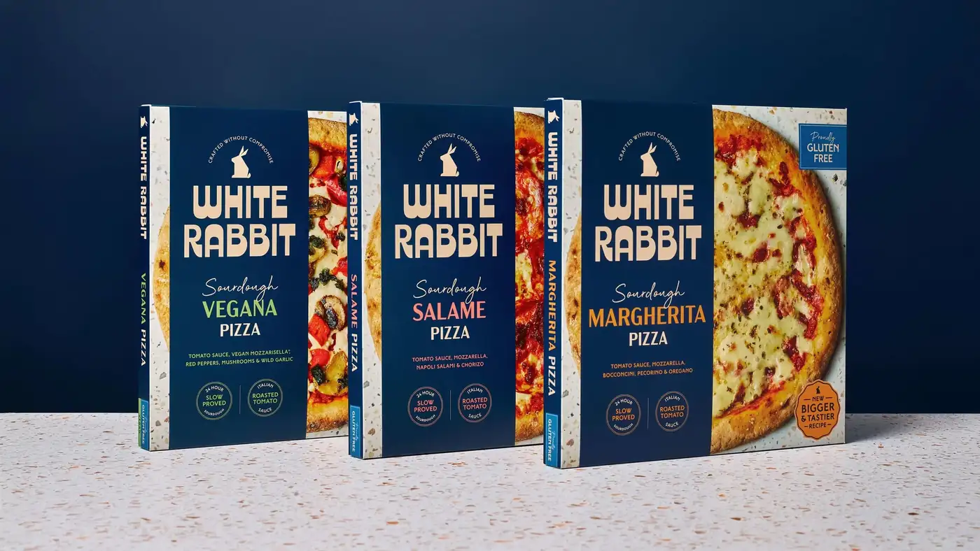
The mark holds a seated rabbit above a heavy, generously curved logotype — warm enough to feel like a bakery, solid enough to hold its own in a chest freezer.
Around it, a type system pairs that display face with a script for the flavour names and a clean sans for the detail, so every pack can carry a lot of information without shouting.
05Packaging
One system,
a whole range.
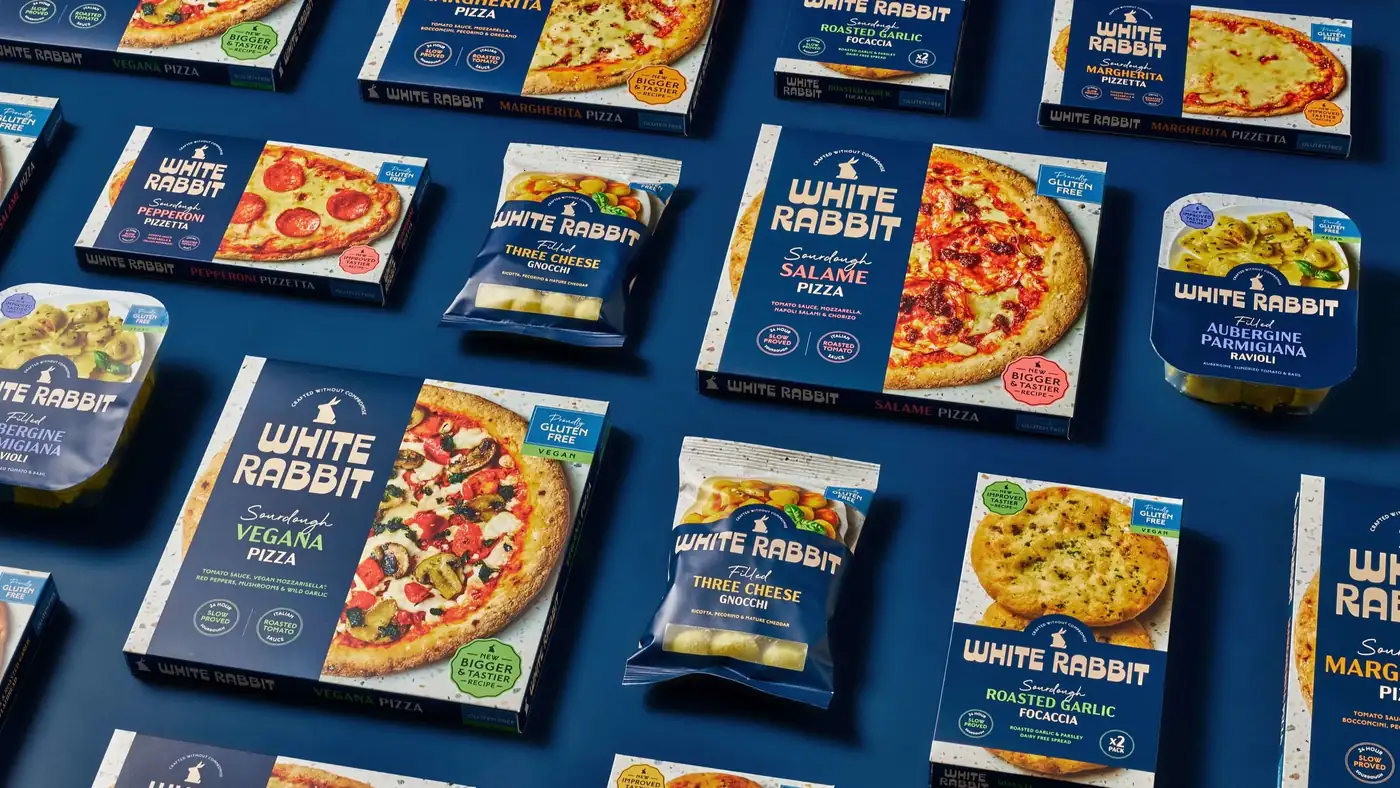
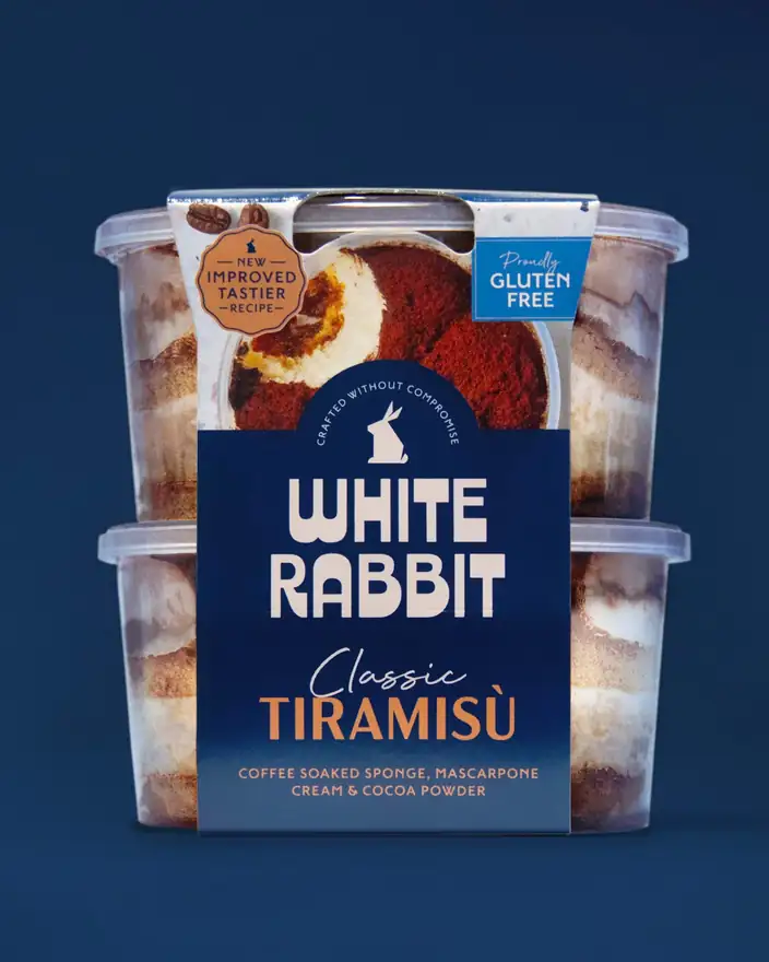
Deep navy and cream carry the brand; a terrazzo edge does the work of a bakery counter; the food is shown split down the middle, half box and half pizza, so the product sells itself from a metre away.
Flavour names are colour-coded, the craft roundels are fixed furniture, and the gluten-free flash sits in the same corner on every single line.
06In store and online
Built for
the basket.
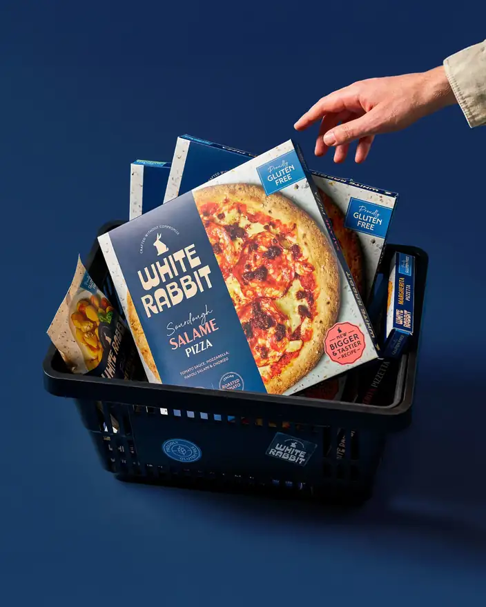
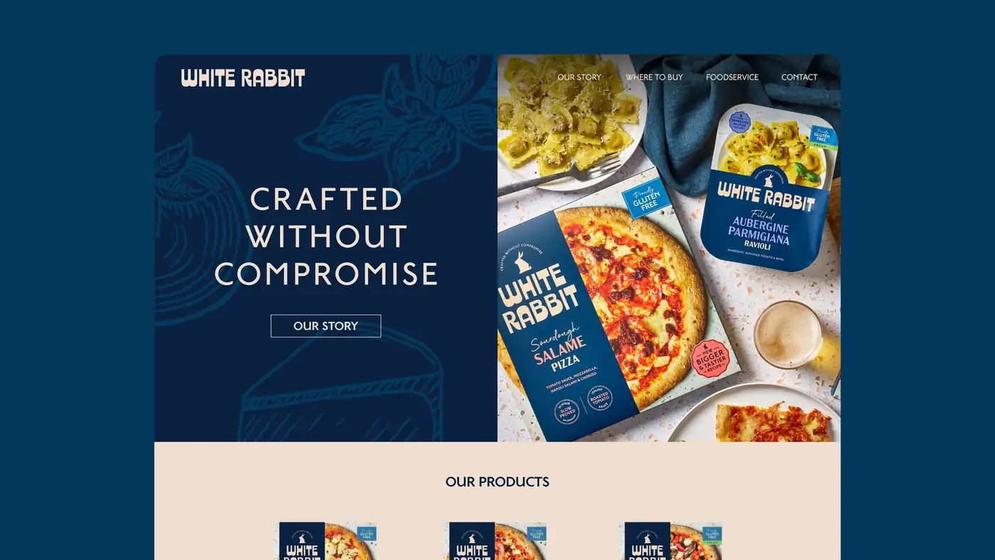
Every decision was tested against the two seconds a shopper actually gives the freezer door — and then carried through to the site, where the same navy, the same line and the same illustrated pantry do the welcoming.
07What we handed over
A brand ready for
the next chapter.
- Position & narrativeA dedicated gluten-free Italian bakery, with provenance and inclusivity as the two pillars.
- Line & tone of voiceCrafted Without Compromise, plus the messaging that lets it survive on a 200mm box.
- Identity systemMark, logotype, type system, colour, illustration and motion.
- Packaging & digitalArtwork across pizza, pizzetta, focaccia, pasta and dessert, and the brand world online.