Alto Alpine
The pinnacle of alpine pursuits.
Client
Alto Alpine
St. Moritz, Switzerland
Category
Premium alpine experience
Ski expeditions and Swiss lodges
What we did
Logo design. Visual identity. Art direction.
Year
2025
01The brief
For those who live
life above the line.
Alto is a meticulously designed immersion into alpine excellence. Helicopter arrivals, personalised itineraries, secluded luxury lodges — every element tailored.
The brand had to hold that standard before a guest ever reaches the mountain.
02Logo design
Alpine brands always put a mountain in the logo.So we didn't.
It's the category default, and if we're honest it's overdone. Alto is anything but cliché, and the mark had to say so at a glance.
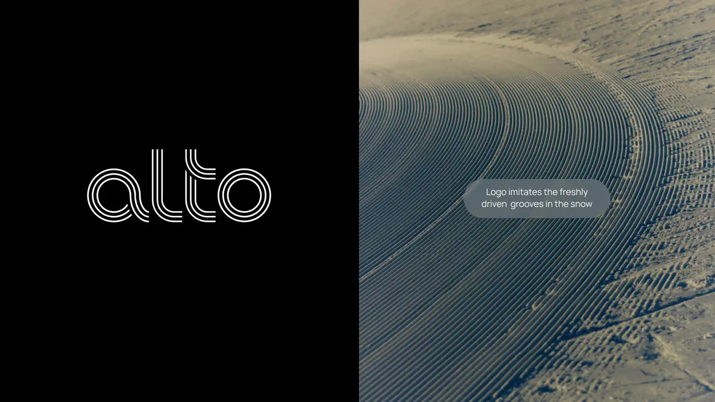
So we asked what actually makes the ski experience — and the answer is the skiing. Freshly driven snow leaves those beautiful parallel lines running alongside each other. That became the idea.
The wordmark is custom, constructed entirely from parallel lines that imitate the groove. Premium, and tied back to the heritage ski experience, without a summit in sight.
03Art direction
Built to let the
imagery breathe.
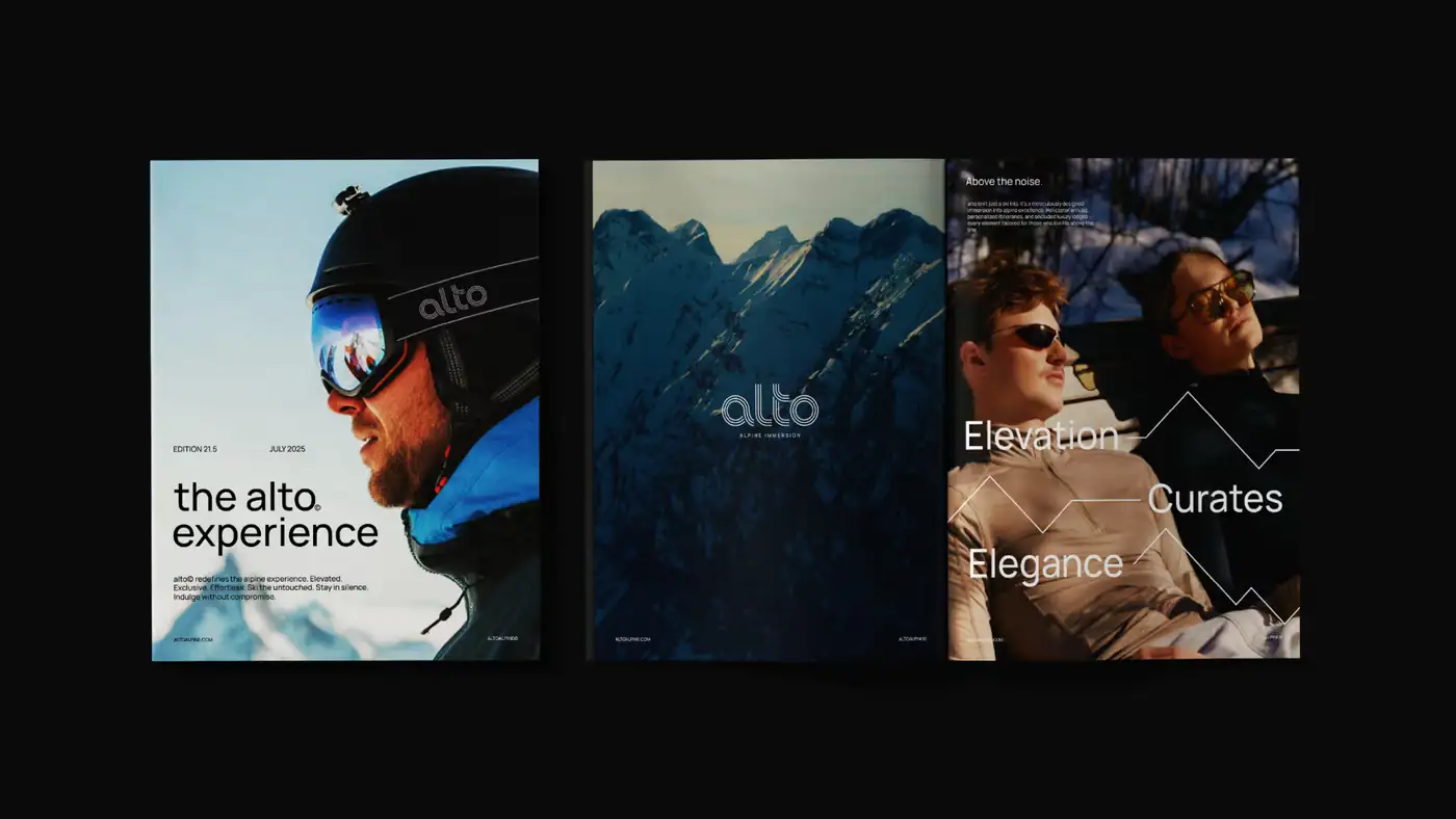
The whole visual system exists to support the photography. A clean Swiss sans, Swiss layouts and a monochrome palette — nothing competing for attention with the mountain.
What we were after was the feeling of actually being there on a luxury alpine experience: clarity and elegance.

04Applied
Monochrome,
and never quiet.
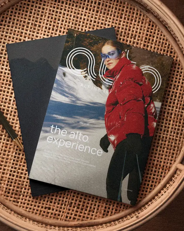
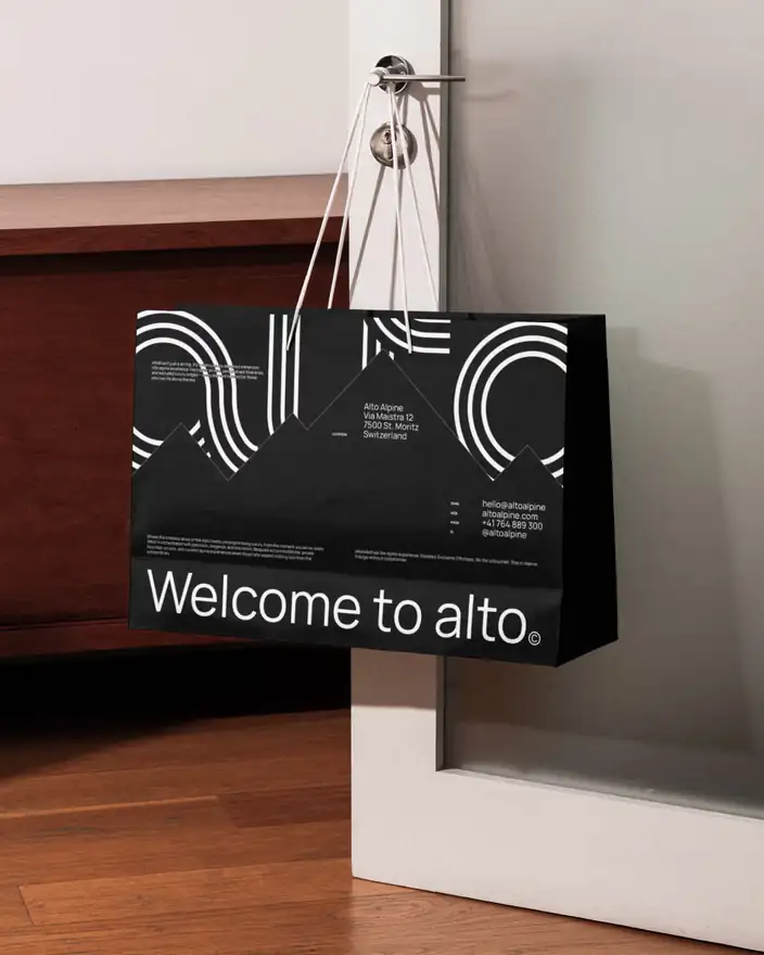
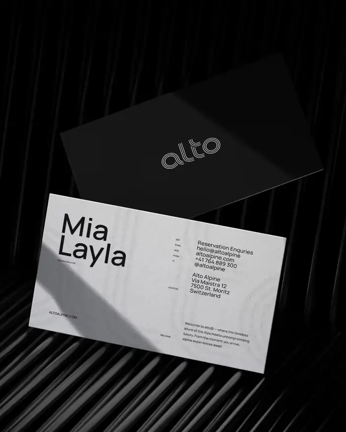
Black and white is the easiest palette to make boring. It stays interesting here because the line motif does the decorating — the same grooves that build the wordmark scale up into pattern, peaks and rule work across the collateral.
05Digital
One line of type,
full-bleed mountain.
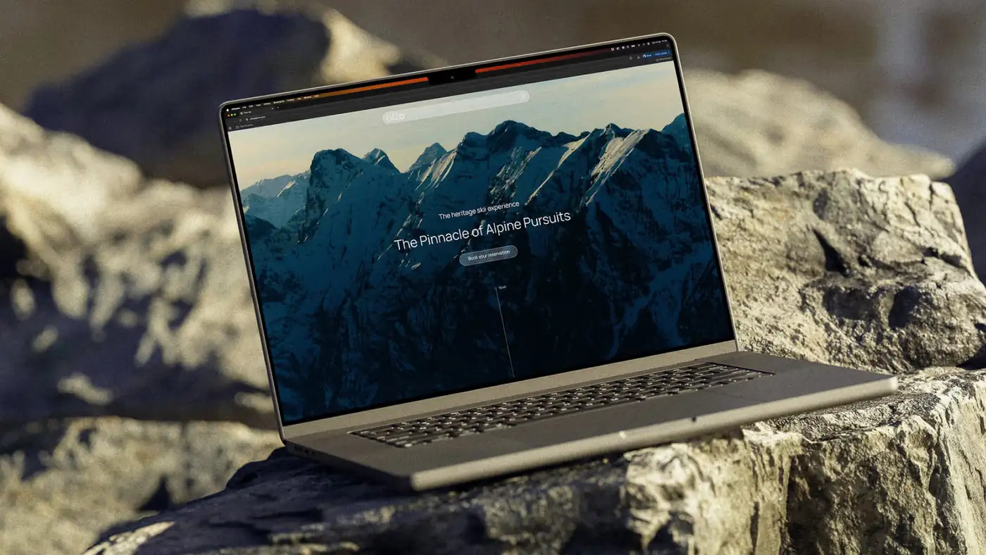
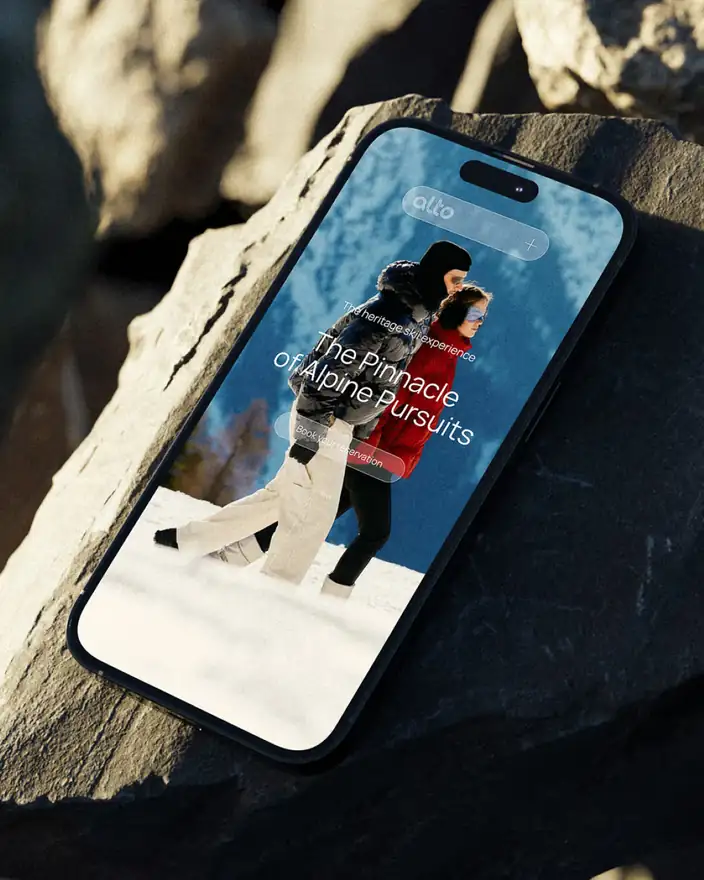
The site opens the way the brand should: a single promise over a single image, with the booking action close to hand and nothing else asking to be read.
06What we handed over
A brand as precise
as the experience.
- Custom wordmarkDrawn from parallel lines, with no mountain and no compromise on category legibility.
- Visual identitySwiss sans, Swiss layouts, monochrome palette and the line system that runs through all of it.
- Art directionPhotography direction and layout rules built to give the imagery room.
- ApplicationsEditorial, retail collateral, stationery and the digital experience through to booking.