Lebara
Join a smarter perspective on mobile.
Client
Lebara
Mobile network, millions of customers across Europe
Category
Telco challenger
Competing with networks many times its size
What we did
Brand strategy & platform. Identity system. Custom typeface. Motion & art direction. Digital product design.
Status
Live in the Netherlands, rolling out across Germany, France, Denmark and the UK.
01The brief
Big networks have spent years handing their customers lemons.Lebara had the better deal and no brand to say so.
Hiking prices. Slashing data. Betting that most people are too indifferent to act.
Lebara's product had always been the smarter alternative — competitive pricing, a reliable network, millions of customers across Europe. It had simply been outperforming the market quietly.
02Strategy
Rekindling the
challenger spirit.
There was an audience Lebara had always served but never spoken to directly: people who had wised up to the mobile market and made a smarter call. Not bargain hunters. People who worked out that paying more was the only thing the big networks were really selling.
Join a smarter perspective on mobile.
That platform became the foundation everything else was built on.
03Identity
Lebara doesn't
just connect you.
It changes how
you see.
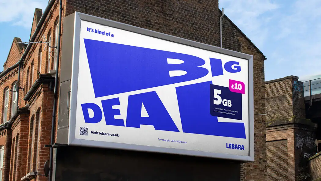
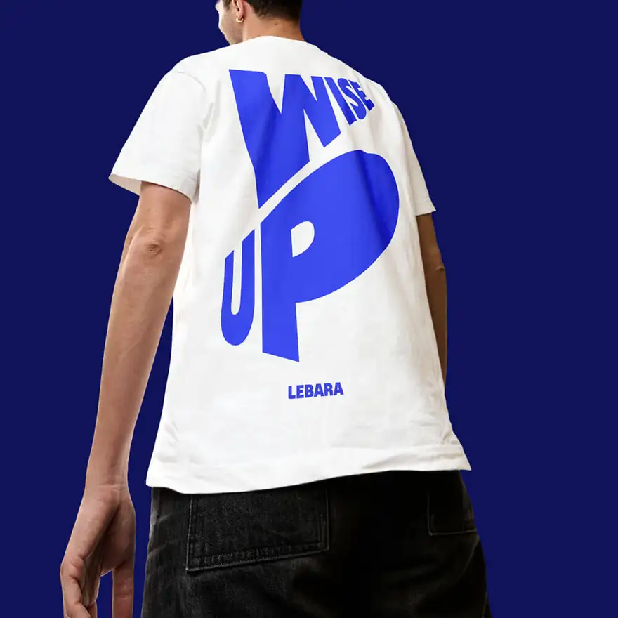
The identity is built on a handheld effect — the sense of something being picked up, turned and looked at from a better angle. Parallax collages, warped and skewed typography, and UI interactions that behave the way objects behave in your hand.
It is a perspective shift you can see, which is what makes the platform more than a headline.
Three levels of expression
One system with a volume dial, so the brand can hold a regulatory footer and a billboard without needing two identities.
Calm and neutral. For anywhere the information has to do the work.
Stretches and bends. The everyday register across most touchpoints.
Warped and distorted to the stylistic extreme. For the moments that need to stop someone.
04Colour
Built on
productive tension.
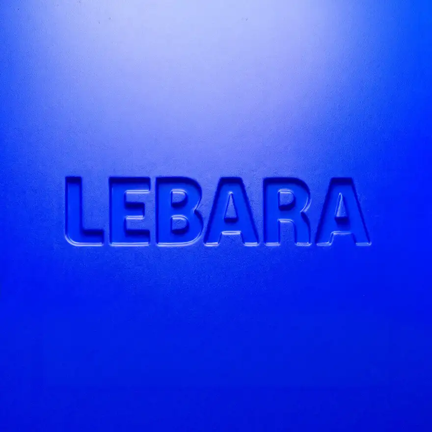
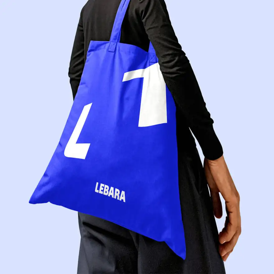
Two colours with two different jobs, which stops the palette from becoming decoration. If everything is loud, nothing is a prompt.
05Typeface
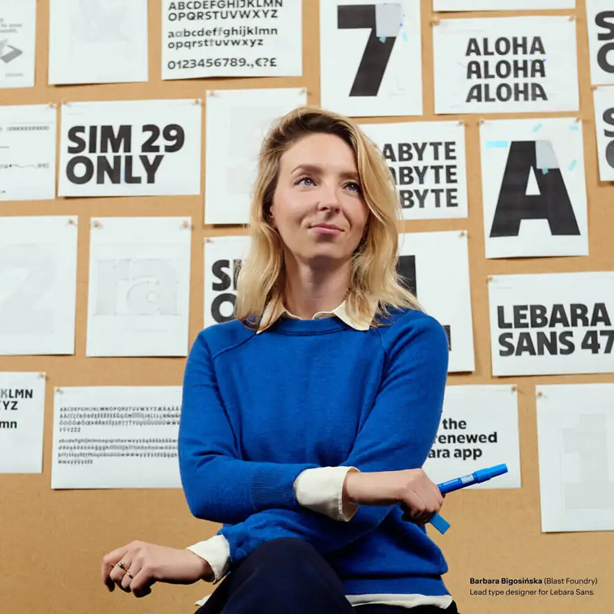
Lebara Sans.
A custom typeface gives the brand a voice entirely its own — and, more practically, gives the warping system something built to survive it. The letterforms were drawn to be stretched, skewed and cropped without falling apart.
06Product
What you feel in
the brand, you feel
in the product.
We defined the look and feel of Lebara's digital products so the identity doesn't stop at the ad. Buying an eSIM, topping up a balance — each interaction was designed to behave in precisely the same way as the brand does.
A brand that promises a smarter perspective can't hand you a clumsy checkout.
07Built to grow
Sharp, ambitious
and coherent
wherever it lands.
The rebrand is live in the Netherlands and rolling out across Germany, France, Denmark and the UK. Through licensing partners it travels further still — which is why the system was built with levels rather than fixed layouts.
- Strategy & platformJoin a smarter perspective on mobile — the foundation for brand, product and comms.
- Identity systemHandheld effect, parallax collage, three-level expression system, colour, art direction.
- Custom typefaceLebara Sans, drawn to be stretched and skewed without breaking.
- Digital productLook and feel for eSIM purchase, top-ups and account, matched to the identity.