kfzteile24
Born in the garage!
Client
kfzteile24
Part of the k24 group, Germany
Category
Consumer goods & retail
Car parts and equipment, omnichannel
What we did
Brand strategy. Trend report. Digital strategy. Visual identity. Digital design. Motion identity. Toolkits & templates. Online guidelines.
Audience
Private and professional workshops
01The brief
Germany knows
the name. The brand
had to catch up.
kfzteile24 is Germany's best-known brand for car parts and equipment — but the audience buying them had gone digital, in private garages and professional workshops alike, and the product and service range across the k24 group kept growing.
The rebrand aligned the brand presence of an omnichannel retailer with both of those moving targets.
02Motion identity
The mark builds
itself out of
a road mark.
The logo resolves from the same diagonal stripes that run through the rest of the system, so the motion isn't decoration applied afterwards — it's the identity explaining where it came from.
03The system
Road marks
and part numbers.
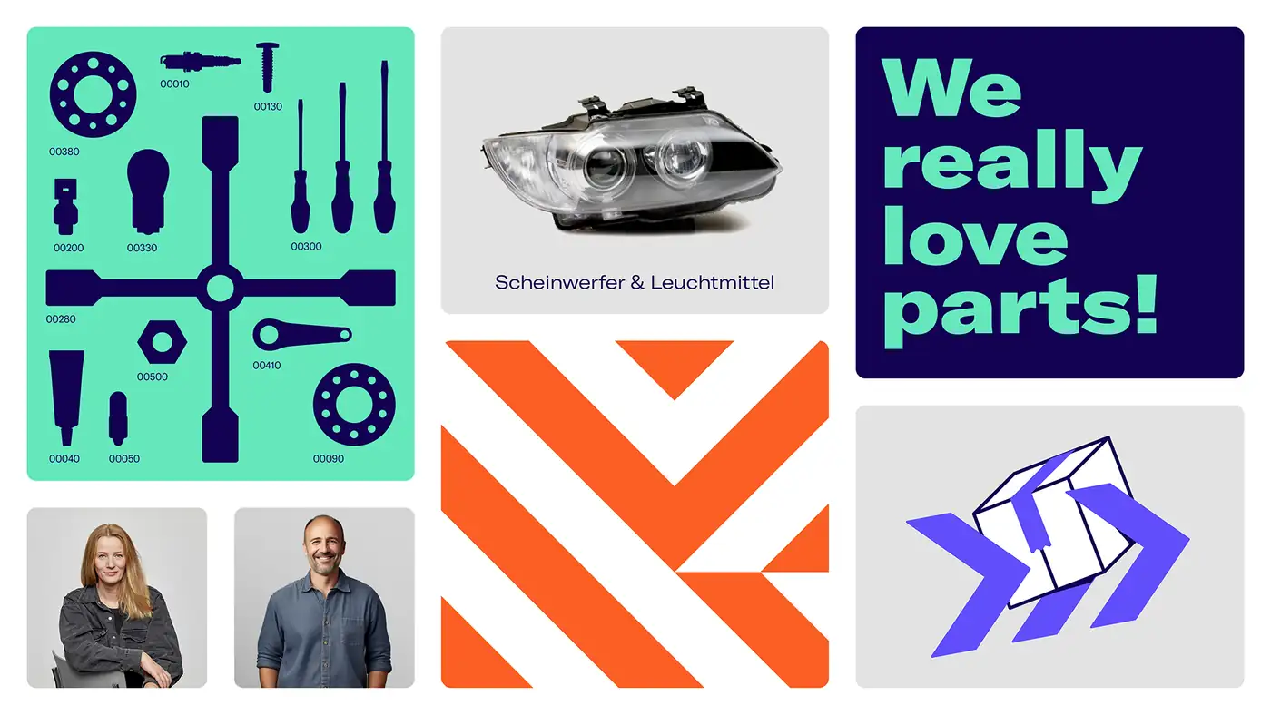
Two graphic devices carry the whole brand. Road marks — thirteen of them, built on one grid, each with its own name and behaviour, rotated only in ninety-degree steps — give it pace and direction.
Part silhouettes do the other half of the job. Every part carries its own item number, which turns a catalogue of three million SKUs into a visual language instead of a problem.
04Digital design
A shop, not
a brand film.
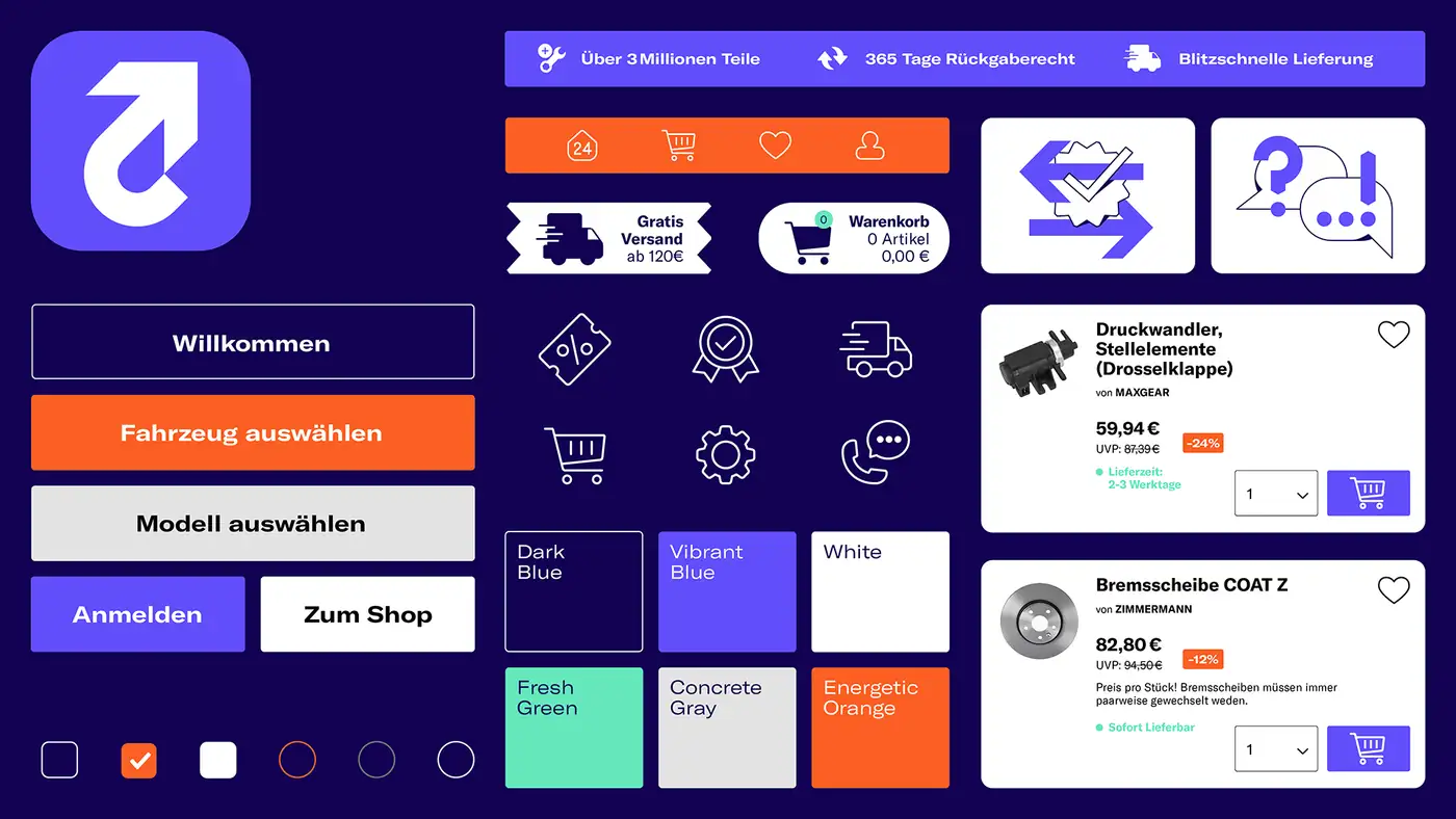
Most of this brand's life is spent inside a product listing. So the identity was drawn down to interface scale — icons, buttons, badges, delivery states, price and discount treatments — with orange reserved for the things a shopper actually needs to find.
The colour hierarchy is the usability rule. If everything is a highlight, nothing is.
05Content
Loud, funny,
and full of people.
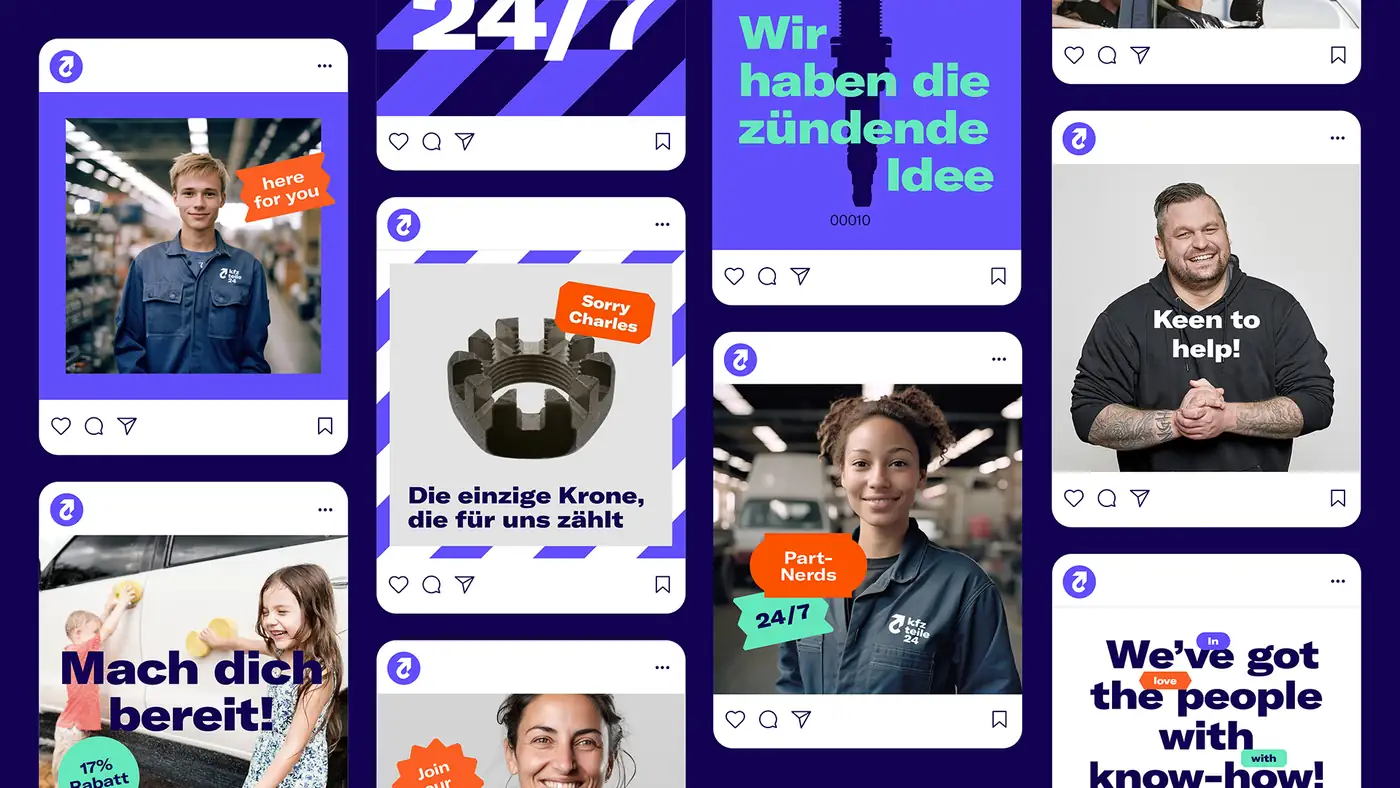
Social is where "born in the garage" gets to be a personality rather than a claim: staff portraits, part jokes, and the sticker set — pills, tokens, promises, signals — doing the talking over the picture.
06Toolkits & guidelines
Written to be
used by everyone
who isn't us.
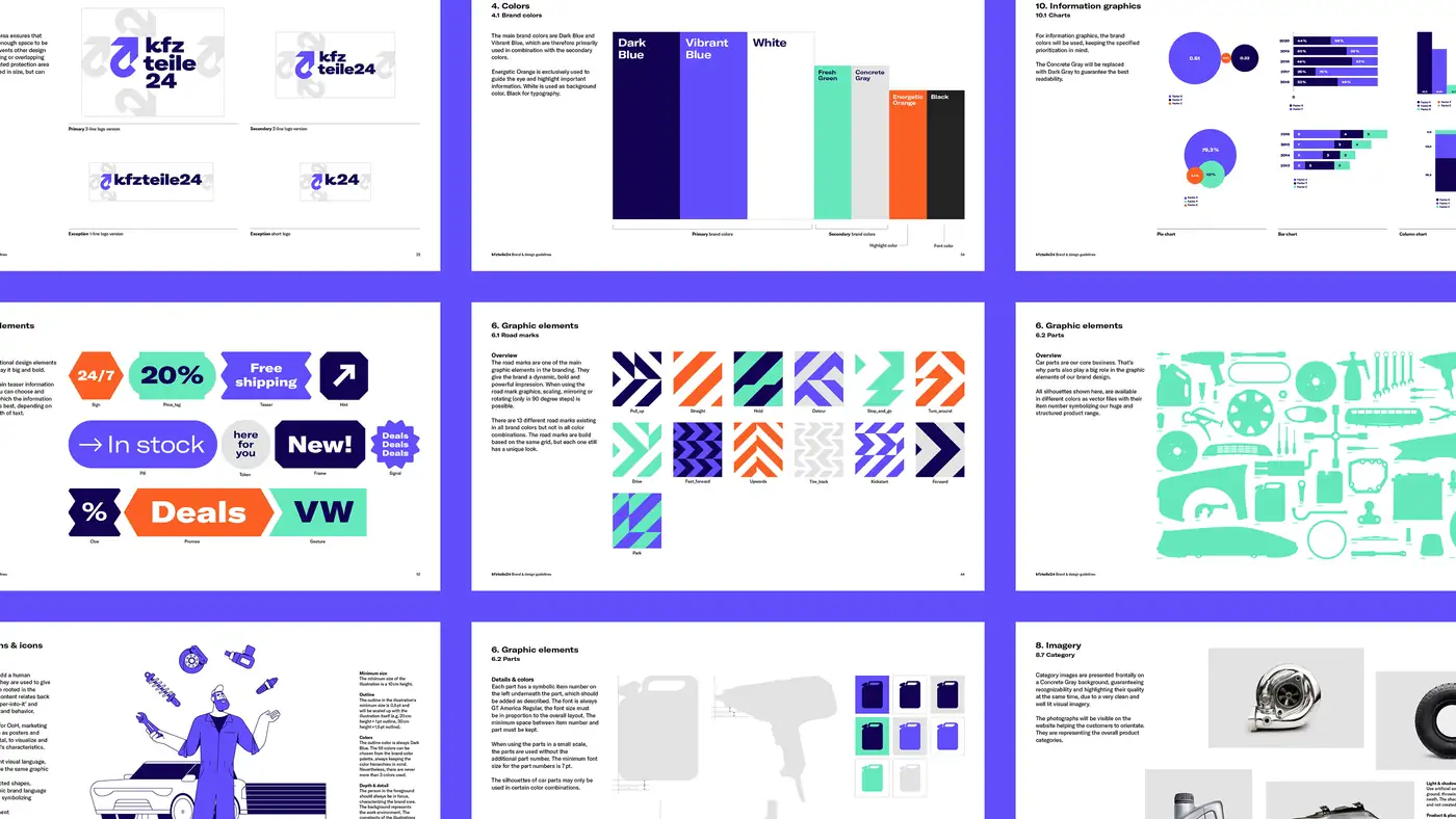
A retailer this size makes far more artwork than any studio can. So the deliverable was a working system: online guidelines, templates and toolkits covering logo versions, colour priority, road marks, part treatments, illustration, imagery and information graphics.
07What we handed over
A brand that runs
without us.
- StrategyBrand strategy, trend report and digital strategy for the k24 group.
- IdentityLogo system, colour hierarchy, road marks, part silhouettes, illustration and imagery direction.
- Motion & digitalMotion identity and digital design down to interface components.
- ToolkitsTemplates, toolkits and online guidelines for teams across the business.